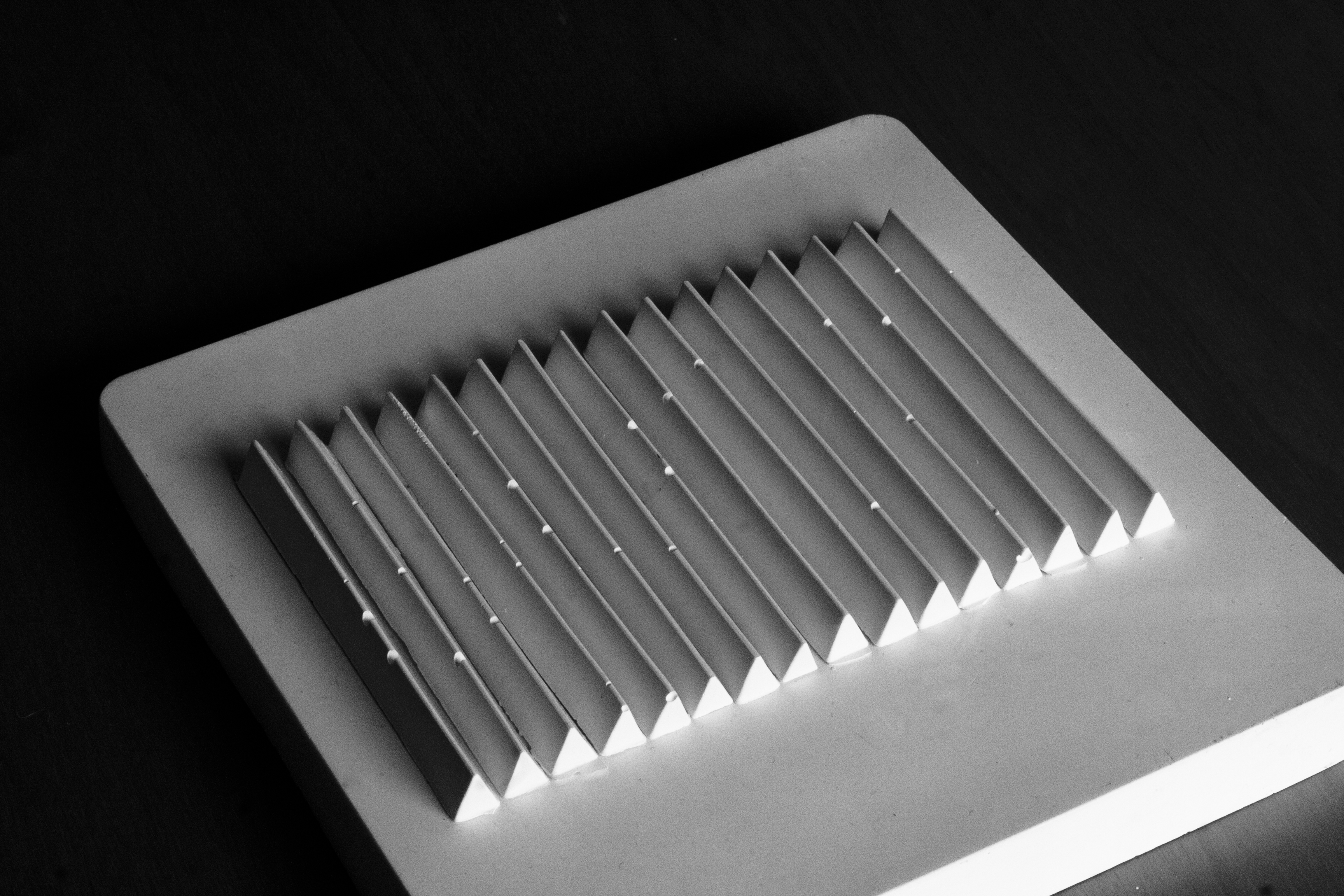
I have been casting plaster into ice cube trays, these long sticks, triangular in section, make for interesting shadows. I made them in two sessions, the first set were marred (or so I thought) by air bubbles interrupting the ridge but having now been looking at them for some time, I like the randomness of the negative spaces. The second set were almost perfect though some have lost their corners. It was only after having photographed them that I saw the similarity to an large work in wood by Susumu Koshimizu 1971 – ‘From Surface to Surface’ that I had seen at the Tate Gallery. From the label – ‘Koshimizu investigates the substance of wood by sawing planks into different shapes, exposing their surface qualities through different kinds of repetitive cuts. The geometric lines produced by an industrial saw contrast with the slit irregularities resulting from missing chips, slips of the saw, and rough surface of certain edges. Koshimizu was part of Mono Ha (School of Things), which reacted against the embrace of technology and trickery in mid 1960s Japanese art. They sought to understand ‘The world as it is’ by exploring the essential properties of materials, often combining organic and industrial objects and processes’
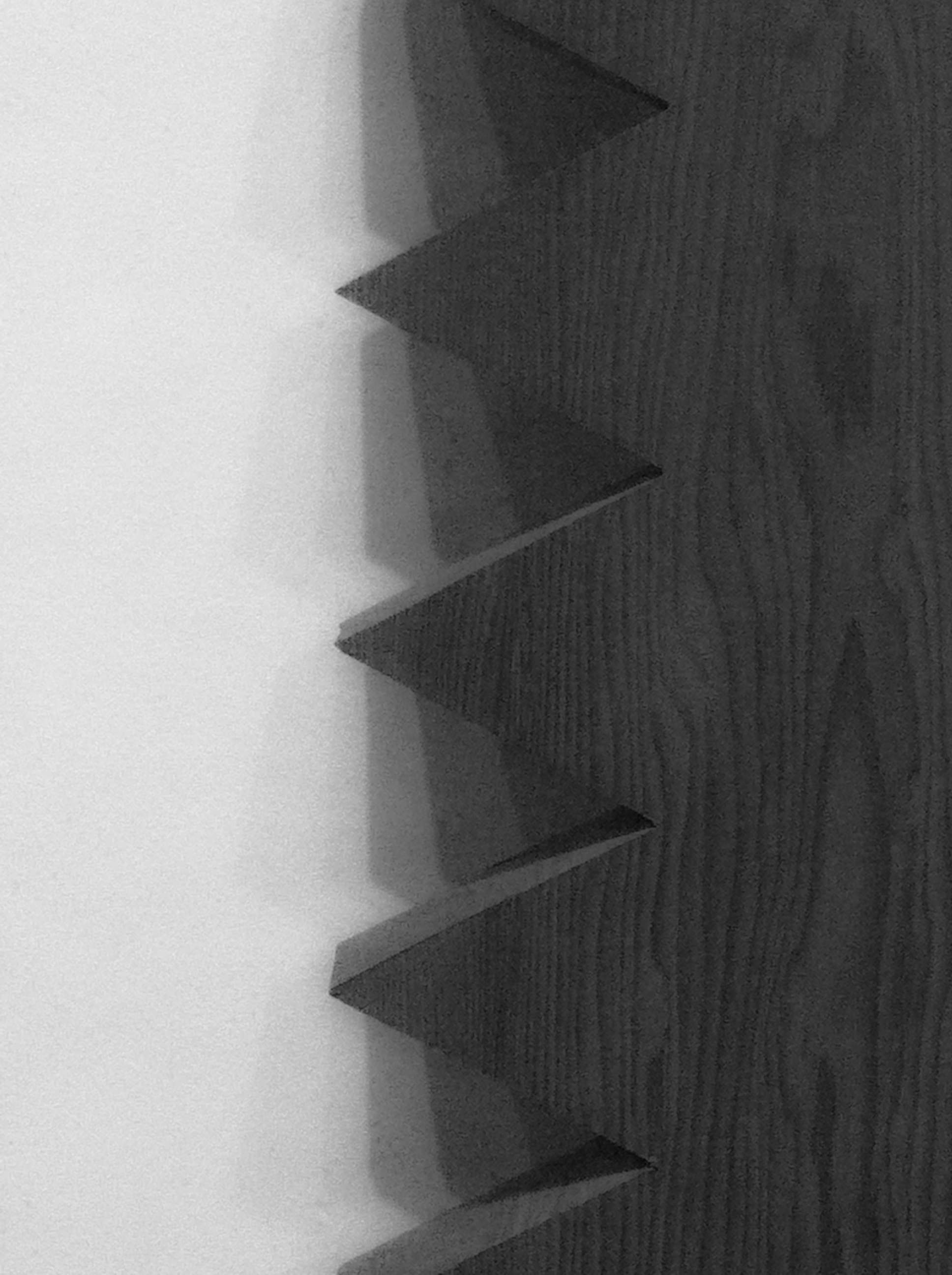
Having now reread the information label I am pleased to discover that we had in common, not only looking at repeated regular forms but also of their inconsistencies and flaws. The particular reason for photographing this work was for the shadows that were being cast on the white walls by the multiple spotlights above. I can count 5 in this photo but I think there were more. Lighting my castings with several sources is something I must try.
Tag: Art
Creating Cast Shadows – Eggs
I want to explore creating shadows with eggs so I’m going to try making a mould so that all my eggs are the same shape. Some of these real eggs have subtle textures which I love, I don’t know if I will be able to combine areas of texture from several eggs into my mould, I hope so. I think the moulds will be half-eggs, which will make it easier to create the shadow effects I want.
A Frosty Winter Afternoon
All the countryside to the West of London was swathed in frost, colours reduced to a muted palette of greys and greens until the sun began to set and the sky began to flush as we passed Newport. Taking photos with a mobile phone is not ideal when the light is low and you’re travelling at speed and the train windows are dirty but I was still able to capture the mood of cold blurry landscapes. I also found something more abstract to enjoy, especially where the train lights and the phone itself are reflected in the train windows.
Takao Tanabe
Today I visited an exhibition of the work on paper of this Japanese Canadian artist at the McMaster Museum of Art in Hamilton, Ontario.
I was absolutely in awe of his graphite drawings of the Prairies and water-colours of Islands.
Here are some examples, photography was not allowed in the exhibition so I have borrowed the images from the internet. The photos do not really do justice to the artistry but I will try to explain what you can see whilst viewing the original works. I am somewhat qualified to do so having worked as a conservator of paintings for many years and also being an amateur water-colourist.
This drawing “Inside Passage” is on paper with a water-colour under-painting, I think just of Ultramarine Blue with maybe a touch of Indian Yellow added to lean it towards green. This under-painting is almost continuous in the sky, though vague areas are left blank to represent clouds. The colour is continued through the area of distant hills and in the top third of the lake water below the dark hills. Tanabe must have used a large brush, possibly having wetted the paper first to achieve an even spread of the colour wash.
Afterwards, when the paper was completely dry, he has added layers of graphite powder using a soft brush and also using a graphic stick/pencil. In some areas, he may have erased areas again to achieve the lighter strokes in the sky. In the lake water, it looks as though he has repeatedly cross-hatched to represent deep, dark water. Again the dark hills are hatched over and over to give the depth of dark forests and the skyline is rich with strokes representing the movement of branches and birds. Altogether it demonstrates consummate skill in both wet and dry media.
In this drawing ” Foothills South of Pincher Creek”, Tanabe uses a fine graphite pencil throughout and simply adjusts the angle, thickness, pressure and direction to portray the rain-soaked sky and stretched out foothills. Another in this series shows that Tanabe has used the same blue/green as in the “Inside Passage” under-paintng wash just in the hills, it is very subtle, hardly noticeable but it lifts the land mass away from the sky and water.
I saw another work, a small water-colour painting of the morning sun rising from the sea near a string of islands on the horizon. Sadly I could not find an image of it on the internet but it was a delight of restraint. The scene was depicted adroitly with probably just two colours, Yellow Ochre and Payne’s Grey. Yellow wash was applied over the whole paper, then when dry, an extremely thin wash of Payne’s Grey in the sky, carefully keeping above the horizon and allowing the wash to pool slightly in the rough texture of the paper.
Next, the lower part of the painting – all of the sea except the exact horizon, was wetted and a heavy and uneven wash of Payne’s Grey applied liberally and allowed to settle and the pigment separate in the hollows of the textured paper. (Having tried this out, I think Payne’s Grey was too blue but adding Brown Madder hepled to make it closer to neutral)
Finally the islands were painted in with a fine brush, simply silhouetted against the sky.
In daylight I will take a photo of the image from the catalogue.
Bangor Pier
Looking through old family photo albums recently, I found images my Dad had made sometime in the early 1960s. I don’t recall having seen them before though I must have done at some time. Just two months ago I happened to be there, on Bangor Pier and took some very similar photos. I found that rather heart-warming, not the usual tourist choice, we must share some sensibilities and an interest in form. We must have both loved these detailed patterns made by the series of cast benches.
You must be logged in to post a comment.