Life Drawing

I have been attending life drawing classes every two weeks for a couple of years, it’s been a thoroughly enjoyable experience but with very varied results.

Our tutor has been teaching us to use a variety of media, including pencil, conte, charcoal, chalk, pen and ink, felt tip pen and water and also an orange/brown wash.

Improvements in my technique have been sporadic, some days I feel as though I can  draw well, other days I despair.

You are not going to see the worst ones, mostly they are embarrassingly bad. Here is a selection of the ones I feel happiest about. Its odd how one week I can make a successful two minute sketch with my ‘wrong’ hand and the next week every thing I draw is quite awful.

Gradually I have come to realise that my drawings are always better when I concentrate on the head and shoulders of the models.

One of the earliest from 2016, on coloured paper with white chalk and charcoal.

Our tutor suggested using blue chalk for the half tones but I changed my mind after making a couple of marks.


Low Relief Construction

A whole series of my work has been inspired by a drawing of my father’s from 30 years ago. His original was based on visually extracting shapes from a classic Tumbling Blocks schema used in drawing, painting, patchwork and many other formats.

This is his drawing on paper in ink and two thicknesses of line.

I have made a number of drawn versions of my own.

A sketched and cut version in heavy water-colour paper.
A sketched drawing in white crayon on water-coloured paper.
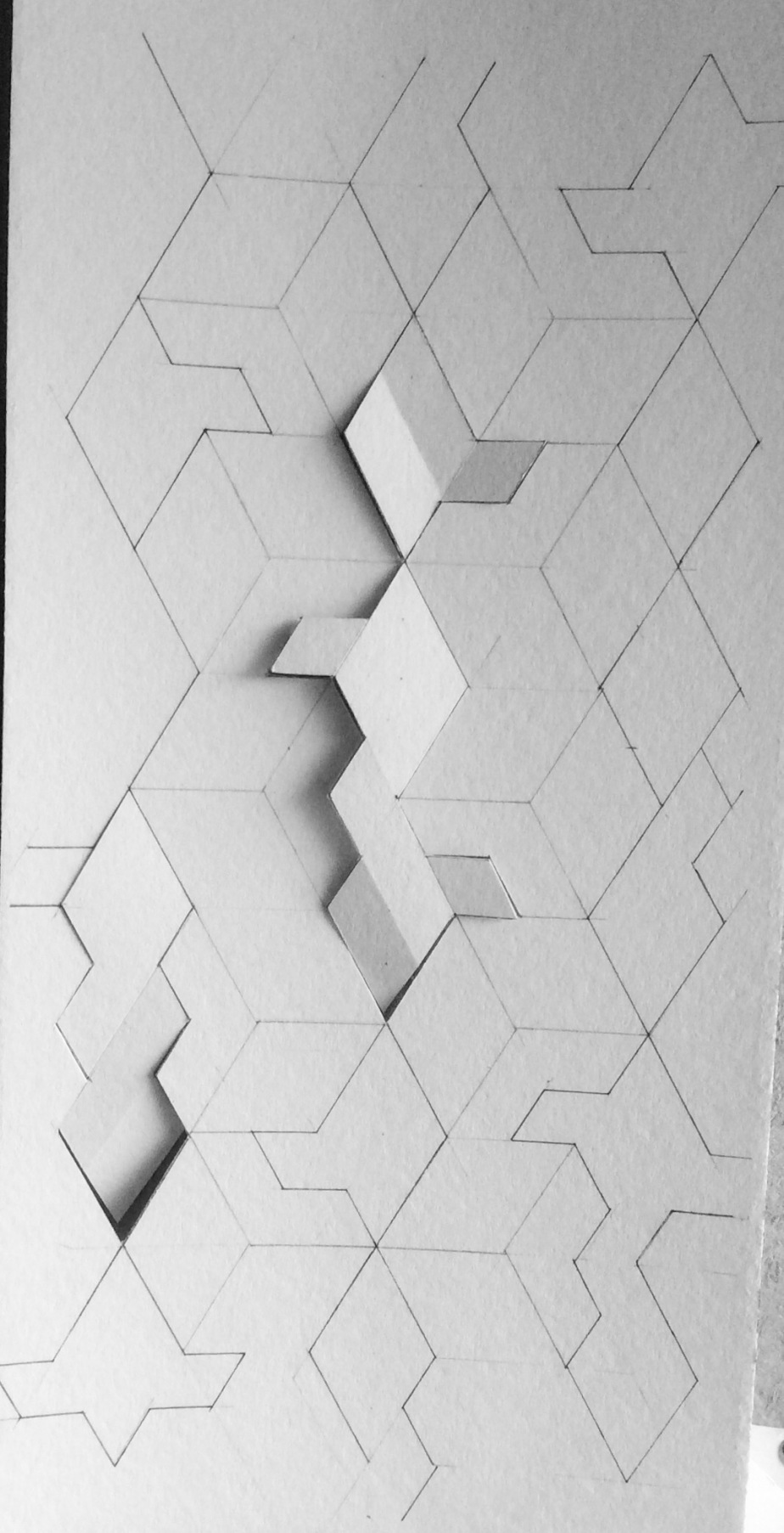
After many other versions in drawing, painting and cutting I have now embarked on a low relief version in painted plywood. The pieces were cut out usung a tiny reciprocating jig-saw that my mother owned from the mid ’80s.

Here are some of the stages I have passed through. Hopefully tomorrow it will be finished.

Drawn out with pencil and set square, then cut out with the jigsaw
img_5711
The complete design incised into the backboard
Laying out the pieces and deciding how far away from the surface they should sit.
Some of the pieces with spacers glued to the back
Painted and ready for assembly

Woodcut – a beginning

I have long admired many practitioners of woodcut, woodblock and Lino cut printing, I’ve thought for a long time that if I tried it, I could get really obsessed with it.

In the last few months I have attended three print-making workshops. The first was at the Tate Modern, taught by the Illustrator Lizzy Stewart  www.abouttoday.co.uk. I enjoyed it immensely.

Lizzy suggested we each bring a piece of text or a poem which might inspire us to make illustrations of that text, mostly using simple mono-print techniques, using just black ink and metal or glass plates.

I took Robin Roberstson’s poem “At Roane Head” to work from and made this. It was to be one of four illustrations in a long thin book but I did not have time to finish it. I must do so one day.

roane

I have also taken part in a woodcut ad print workshop with Jonathan Ashworth at the London Print Studio in Maida Vale.

I loved cutting the wood plate, really tried hard to create an intricate and accurate double image, to be printed in two colours.

It took longer than the time available but I did make some interesting images and have made several more prints at home since then. Jonathan is an excellent teacher.

This is actually a test piece, trying out the tool for the first time to see what marks I could make. It was then printed in blue in one direction and then pink in the other producing an interesting range of imagery.1stwc

I have lots more prints in various stages of refinement and in various colours, to be continued . . . .